New Look For CNN International
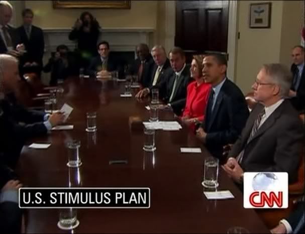
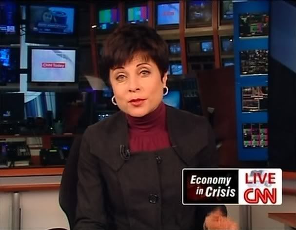
As we speculated on earlier, CNN International rolled out a new look for their graphics Friday night. The new design is almost a replica of the package CNN U.S. rolled out in December.


Labels: CNN International


8 Comments:
Even though there are dissenting opinions, I like it. I think it looks great that the CNN Networks are converging. It would be interesting to see what CNN/US will do when it has to simulcast one of CNN/I's programmes.
ewwww..I hate it now; liked the previous one wayyyyy better.
I think it would be cool if CNN En Español switched their graphics to this also!
All in all, I like it. When the new CNNUS graphics were rolled out a couple of weeks ago my instant thought was: "I would have expected something like this from CNNI rather than domestic."
What I don't like is how those guys at CNNI adapted the logo box. The white background doesn't match up with the black frame of the programme box. The globe is cut in half. Where's the southern hemisphere? The white background behind the CNN bug should be removed in order to have more space for the rotating globe -- after all CNNI is an international network, which should be symbolized in the logo. When the “live”-sign pops up the world ball can’t be seen at all…
Additionally, that white logo box looks totally out of place during the opening sequences of the news shows…
It seems that they are still experimenting and trying to fix this, which is -- on the one hand -- a good thing, because they seem to realize where the weakness of this whole graphic package lies… but on the other hand: how can you seriously roll out a new graphics package and make tiny changes while you're live on air (like earlier on YWT when an ugly, red CNN logo with a black frame appeared and within 10 minutes it was dismantled)? Greetings, Lex
I really like the new lower thirds. CNN US has such amazing graphics compared to International. I wonder if CNN US is responsible for International's graphics because they are so different. It's nice to see more consistency within the networks. I have a feeling more changes are to come and it's exciting to see CNN improving their look.
I think the lower box is too big, it takes a lot of space from the screen!
I must say I preferred CNN's previous look, and also because of the new scenerie in Atlanta. Now, in the CNN center shows you see people behind the host going back and forth, and the computers too. It was better when they had the white studio...
It looks ugly. BBC World News is much nicer and more straightforward regarding the reporting. I don't want to listen to all the chit-chatting between the anchors and anchoressess.
I absolutely didn't like the new CNN-I design, it's like a step-backward of graphic. It didn't look nicer, wasted more space for flashing programming title and no space for headline! That's it. Also, ugly font
Post a Comment
Subscribe to Post Comments [Atom]
<< Home