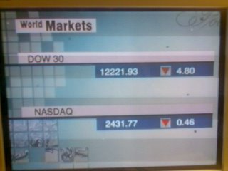
New "World Markets" graphics

Caught by surprise at 0424gmt on CNNI. The "World Markets" graphics shown at the start of some commerical breaks have been completely changed, with new fonts, colour schemes and objects. There is more use of white, but surprisingly I think it looks *less* like the overall CNNI look than what it replaced, which itself was updated when the new look came in earlier this year.


1 Comments:
That's great. Graphics are changing day by day. Every day there is a new change but if you will not implement that at your work so your work will not be updated. It is good to update your work according to changes. Graphics basically is very important it attracts people so it should be updated and well-maintained.
Post a Comment
Subscribe to Post Comments [Atom]
<< Home